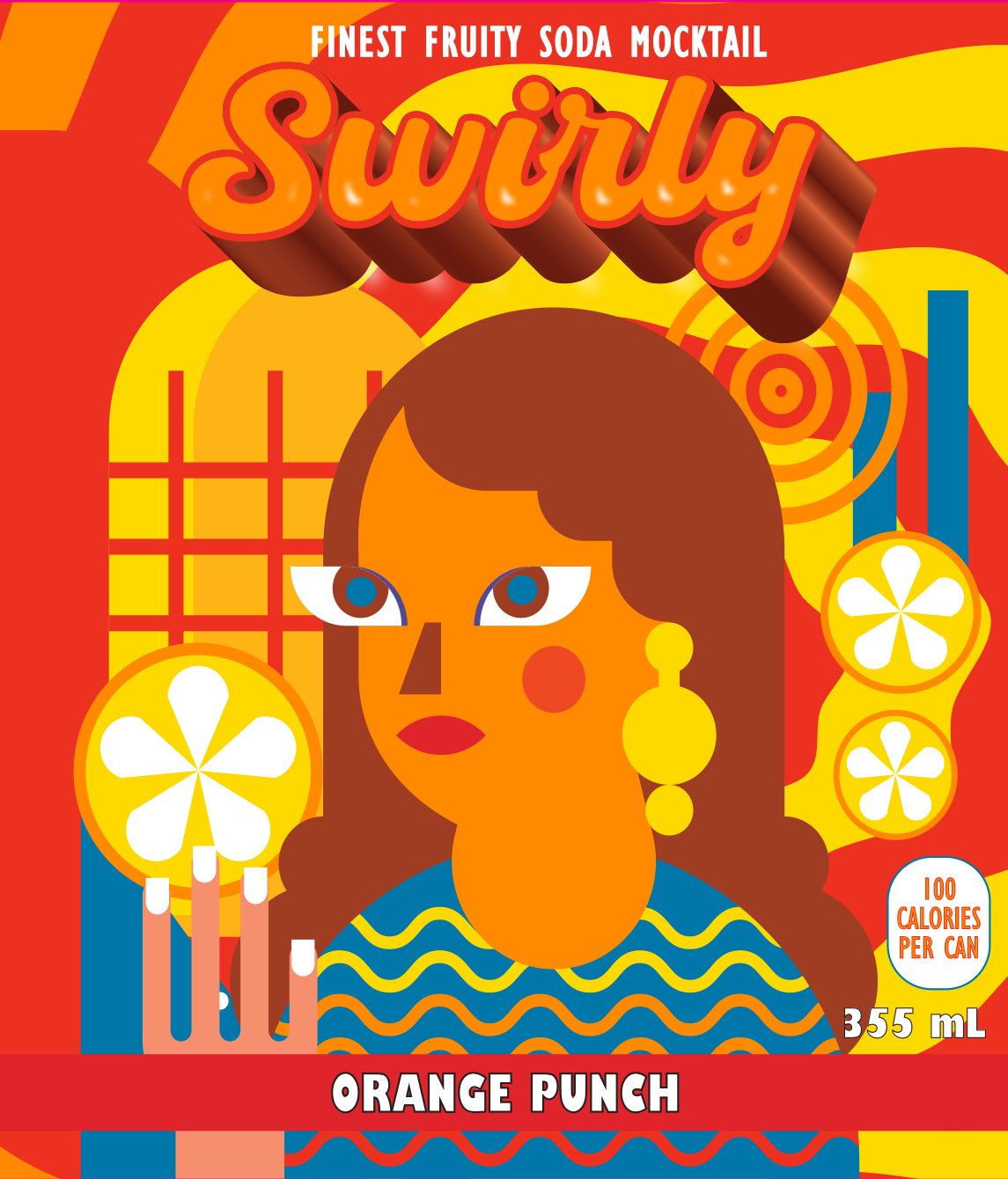
Introducing a unique and captivating design for a soda can, crafted with a clear focus on standing out on the shelf and resonating with the brand’s whimsical identity: Swirly. Our design philosophy is straightforward and customer-centric, ensuring the product is eye-catching and memorable.
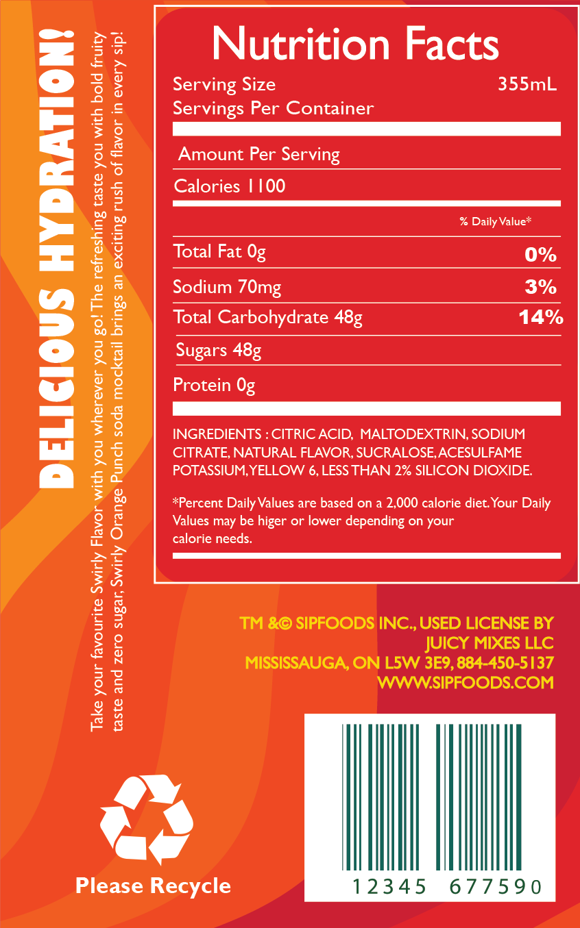
The client’s vision was to create a soda can that immediately captures consumer interest, reflecting the playful and vibrant essence of the brand. With the flavor being orange punch, it was essential to incorporate colors that evoke a sense of freshness and fruity delight. Therefore, the design features a dominant palette of vibrant orange and red, complemented by hints of yellow and blue. These colors not only represent the flavor but also convey a refreshing and energetic vibe.
Key design elements include swirls, heavily integrated into the design to enhance the whimsical and fun nature of Swirly. Additionally, a playful illustration of a girl holding an orange adds a human touch, symbolizing the refreshing burst of citrus flavor inside the can. These elements work together to create a cohesive and engaging design that draws the eye and evokes a sense of joy and refreshment.
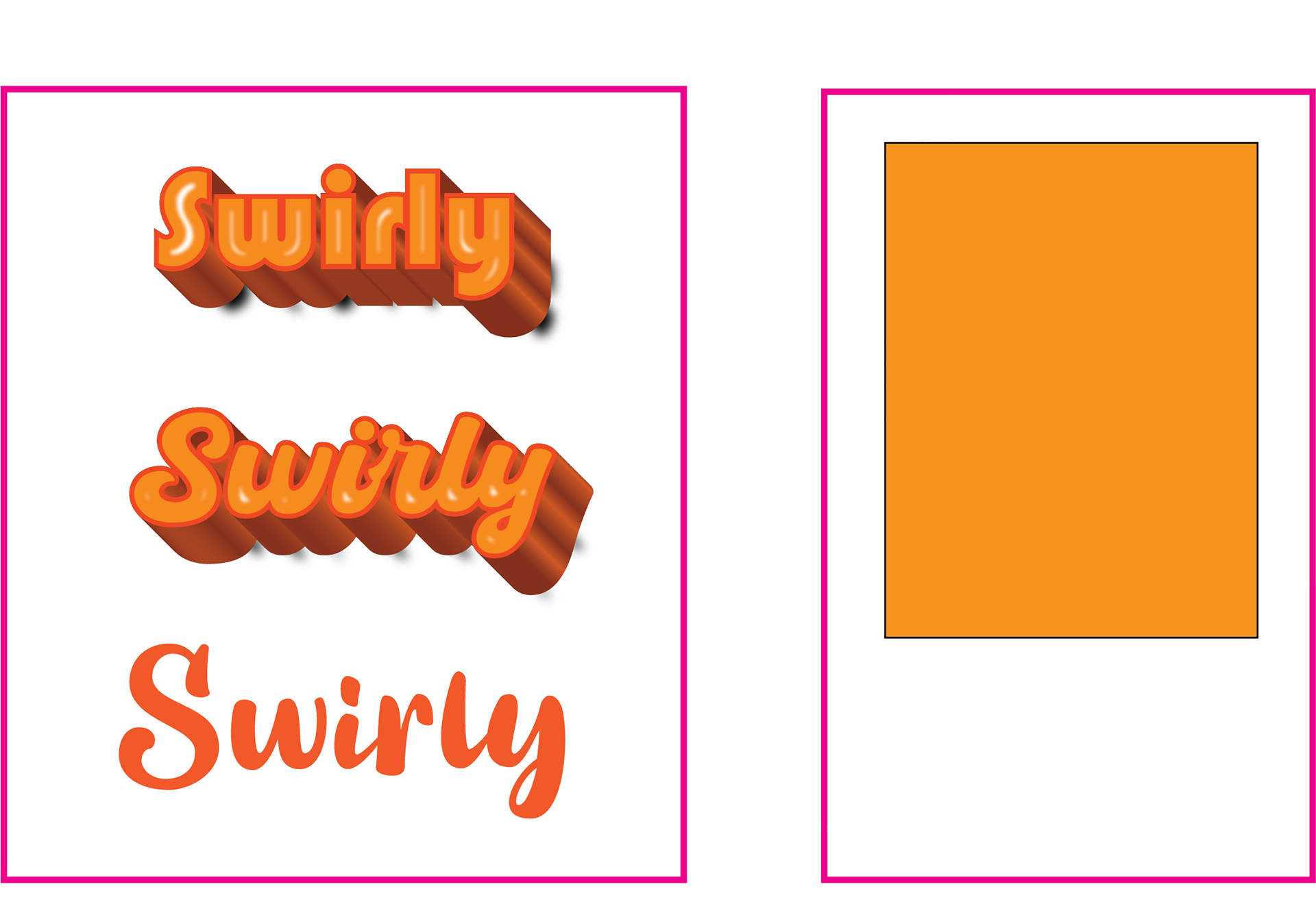
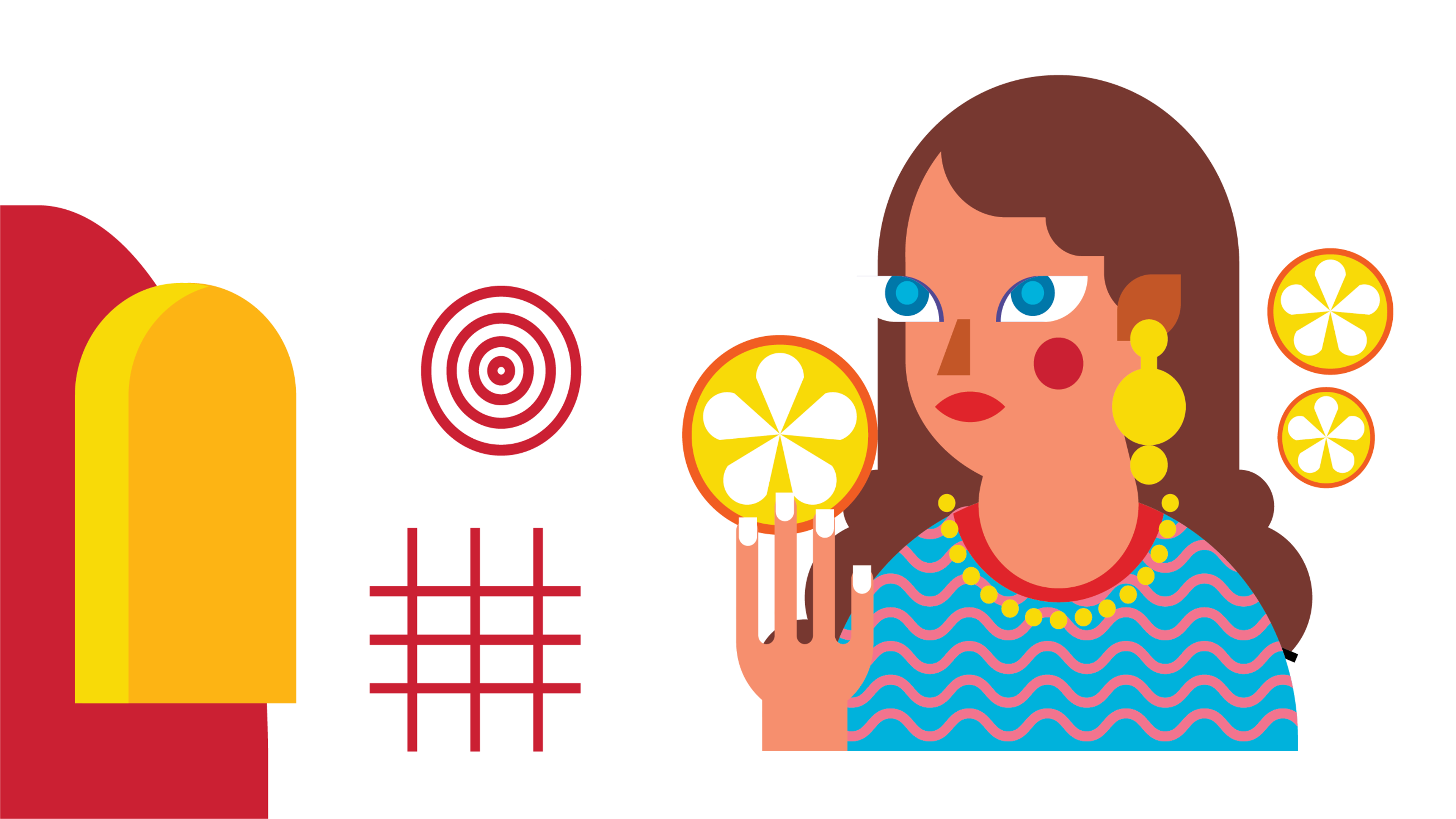
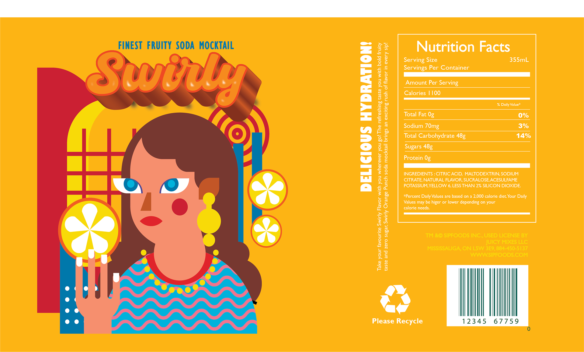
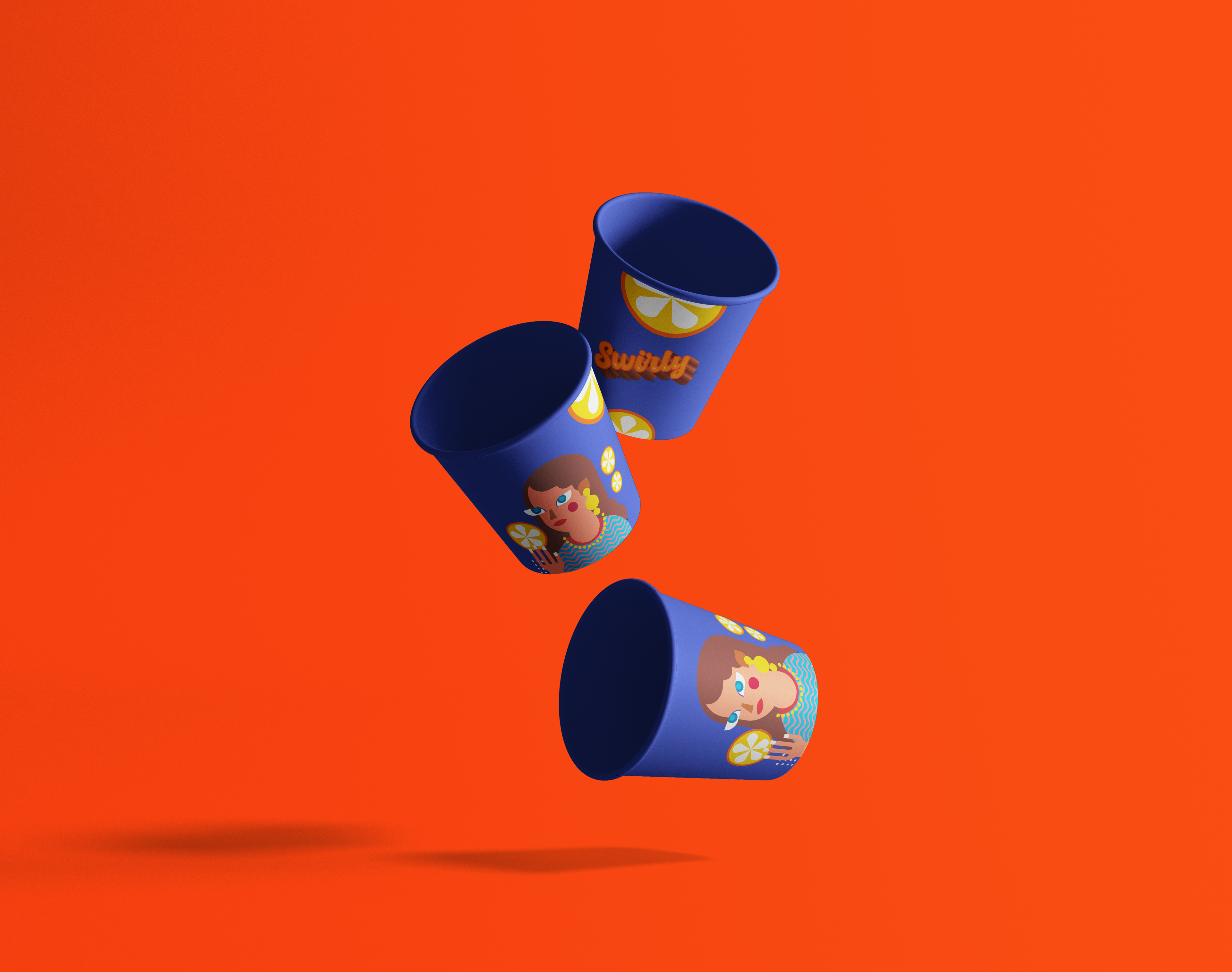
From die-line to illustration to mockups, the entire process was an invaluable experience. The process was both enjoyable and intellectually stimulating, allowing me to blend creativity with practical design skills. The client wanted the design to be eye-catching to stand out on the shelf and draw immediate attention. It needed to reflect the brand's identity by incorporating whimsical elements that align with the brand name, Swirly, and be flavor-specific, using a color scheme that resonates with the orange punch flavor while promoting freshness and fruity goodness. Lastly, the design had to be engaging and playful, with elements like the illustration of a girl enhancing the product's playful nature.
This project was a perfect blend of creativity and practicality, providing an opportunity to design something that not only looks good but also meets the client’s needs and market demands.
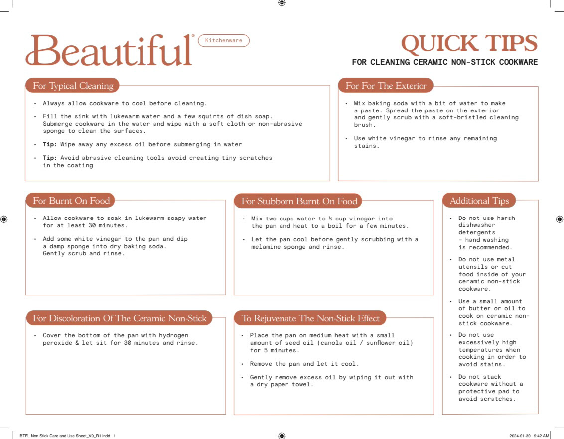
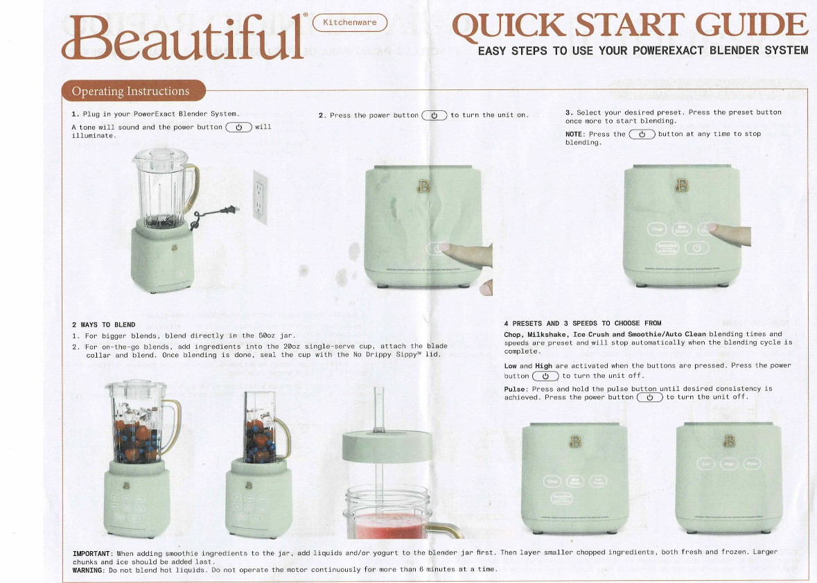
Below is a project for a home appliance line, Beautiful by Drew Barrymore. It includes working on the existing Die-line to create a packaging design for Coffee Maker as well as creating visual guides for their products
